8 May 2013

Screenfly – A Smart Free Tool for Testing Your Mobile/Responsive Website Design

Have you done with your mobile website designing process? What is the next step now? Website appearance testing under different device and screen resolution is must before taking any step forward. With the availability of lots of smart phones and tablets from different brands in the market, it is very difficult to test the website in each and every hardware. At the same time you cannot move further without proper designing testing. Here is the solution for that,

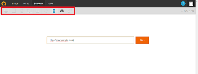
The screenplay is the tool provided by the Quicktools and it allows you to view how your site will appear in different screen resolution and different devices. It uses a proxy server to simulate the devices while you test the website appearance.  It is a completely free tool which has options to show you how a website will look in different screen resolutions from Mobile phones to television screens including Tablet, Desktop monitor and different laptop screens. What you need to do is just enter the website URL in the search box and get started with the testing process.

Highlight to Some Important Features: 


Accessible for All Devices.

As you can see on the main menu, this tool allows you to test the website in different devices like Mobile Phone, Smart Phones, Tablets, Desktop Screens, Laptop Screens and big Television Screens. So now with this tool you have no need to install different software for different devices.


Maximum Available Resolutions for Specific Device. 

The screenplay offers the all possible resolutions for a specific product. Suppose you want to test your website in Tablet devices, this tool offers the screen resolution for different tablet devices like Kindle Fire 7” (533*853), Kindle Fire (600*800), Google Nexus 7 (603*966), Apple iPad 1-3/Mini (768*1024) etc.

Custom Screen Size.

A main advantage of Responsive Web Design is, it works well on all devices with any screen resolutions. Along with testing it on popular mobiles and tablets, you can conduct advance testing and test the layout with custom screen resolutions as well.

To make the testing process simple and more effective, it allows you to enter the width and height of your choice and you can check whether it is working well as expected or not for any size of the screen. Thus, you can ensure that your design will work with any resolution or you can debug it and can implement the necessary changes if it doesn’t work well.

Other Additional Features.

Along with all these Screenfly offers Rotate Screen, Proxy Server Use, Scroll Control and Easy sharing options.

Testing for mobile websites looks even simpler with the online tools like Screenfly and others. You can explicitly check each and every part of your website design for different resolutions using this tool. I personally found it very useful and reliable while specifically designing mobile websites. Hope that it will turn out the same result for you as well. You can share your thoughts and reviews for the tool in the comments below.

Follow the link to access the Screenfly offered by Quirktools

30 April 2013

Advantages of Using Magento Development for eCommerce Website


Magento is an e-commerce web application developed for small businesses. It is also widely adopted by small business and online retailers. 

These are the advantages of using Magento web development in your business:

Customizable Design – 

Using the Magento web development software for your ecommerce business venture will help you create your store design: brand, products and services for the customers regardless of your design capabilities. What’s more? You can upload your designed logo into your webpage dashboard and can select beautifully styled and professionally made template for your site. Also, page realignment is as easy as it gets. Drag and drop feature is also available in Magento CRS.  

Product Options – 

Magento Web Development gives you the option to make your own products and create descriptions and specifications for every product. Let’s say that you sell digital cameras, you can add the specific megapixels and dimensions of each camera. In addition, you can add group options and selections for customers to make it more convenient for them to purchase and inspect your products before buying it for their personal use. Magento’s powerful interface can also filter out the products based on consumer’s preferred options. 
Search Engine Visibility – 

Magento will assist you make your store and products to become more visible and popular, easily view able by customers through top search engines like Google and Yahoo. Magento web design is designed especially to incorporate search engine optimization into it so, as a businessman, you are not required to invest huge amounts of money for your products to become searched online.

Customer Retention – 

Once that you have successfully established a good and striking image to your consumers through your products, your next task is to keep them on track and preserve the good relationship. That’s why Magento web design offers a complete toolbox of applications and tools that will help you retain your consumers

    a. Coupons – Coupons can be customized can be given to your consumers, and followers for their continued patronage to your business
    b. Gift Cards – Magento is also offering gift cards so that your consumers can purchase credits and deposit it into the cards for their shopping convenience. 
    c. Banners – Promotional banners can be displayed to stores, office buildings, and other places which has high chance of visibility. In this way, your product can be popular and easily recognized.


Customer Engagement – 

With Magento, you can give your customers the tools they need to get what they want. As a marketer, you can help your consumers to purchase the products they need through website interactivity and usefulness. An example of this is the one-click product comparison.

Additional Extensions – 

Magento web development content management system offers an application place wherein you can find useful extensions and add ons for your personal website. 

Magento is really a great investment for your business! Here at eTraffic Web Design Group, we specialize in content management system and Magento Development system is also concerned. We will help you gain an edge from your competitors. Contact us and we’ll give you great options and advice on how to become successful in the Internet world! 

19 April 2013

Tips for Having a Responsive Web Design


Designers cannot rely on one screen size anymore, with the consistent evolution of the mobile industry, there is a high chance that a new gadget will sprout another set of design specifications. More than a simple design trend today, responsive web design is a series of modernized tools and tips that aims to reset and rearrange the way data is displayed and shown on all device capacities. Here are some tips for having a responsive web design web page:

Simplicity Is Beauty

It sure sounds like common sense, yes. But really, keeping your website clean and simple as possible is the first thing to do! In order to have a personal responsive web design practice, first things first: the user interface must me plain and simple. Get rid of critical Javascript or Flash that are unnecessary, useless and float positioning, and anything that is redundant or totally useful. Instead, use HTML5 doctype and guidelines for your site, moreover, reset a style sheet and compose a simple and a semantic core layout for your site. Keep all things simple and do not rely on Java special effects or tricks.


The Media Queries

The responsive web design must cater to focus on all the width conditions and specifications depending on the client’s current width. You must therefore load an alternate style sheet to add specific styles. 
The most frequent resolutions in mobile gadgets are the major breaks and the minor breaks specifically 480/768/1024 and 320/720/900 respectively. Always keep in mind that the desktop limit is 1024 px.

Breakpoints

Common resolution breakpoints are sorted out in different ways namely: 

  • In first Gen Smartphones, target the portrait mode with <480 px rule.
  • High end smart phones and iPads cater on the <768 px rule. 
  • >768 px style is suitable for everything bigger.
  • However, it is nice to have these specific size resolutions:
  • <320 px style sheet for low res screens and small sized dimensions
  • For iPads and tablet pc, a precise >768 px by <1024 px rule is considered
  • Wide design desktops should have a >1024 px style sheet
Layout Flexibility

The flexibility and adaptability are also a major consideration for Responsive Websites, flexible grids use columns to arrange and organize web content. Fluid layout is a good way to be ready for any kind of screen size and orientation. When combined with the right media queries it is more likely for your site to become adaptive to screens.

Appropriate Picture Dimensions

Apply the first tip here: keep all things simple and uniform. Maintain a fluid style in the pictures. The adaptive setting for a responsive web design is 100 % width. On the other hand, breakpoints cannot be manipulated in a media query alone. That’s why it has two possible solutions: use background images or show or hide parent in media inquiries.

The Max and the Min

You can use max-* and min-* as boundaries applied to your relative sizes. This will prevent your layout to grow in a ridiculous way when shown in an either large or small device or gadget. 

Linearize

One major rule is to set up in the low resolution style sheet is to get all the content in one column. This is easy to achieve. In a nutshell, simply override the width of every column bloc in your mobile sheet to 100 % width. 

Skip the Non Essentials 

Some parts of your web design will never appear or be used in a mobile context: Remove them. Think about the critical parts of your site that needs to be included: advertising, products, tips, FAQs and tips are the important points. 

Keeping it REAL

Many mobile browsers on the market nowadays copies a desktop view option in the browser: nicely putting and squeezing all high resolutions into tiny monitor screens. A powerful feature, yet a major obstacle to responsive web design. 

With these helpful tips you must be able to compose a useful and efficient, top of the line web page that is adaptable to all mobile devices. Creating an adaptable web page will result in high traffic, and success of your business. eTraffic Web Design is the leading web design and development company in Australia. You can also contact the experts at eTraffic to get the solution of all your web design or development related queries. 

11 April 2013

Website Development Using Joomla CMS and its SEO Benefits


Joomla is, perhaps the most used content management system in the market today, and many small and big enterprises have invested in this. So, are you optimizing your own Joomla site and using effective tools for successful SEO? If not, here are some tips on how to become a winning Joomla user

User friendly URLs:

In order for web search engines to find your website, you need to compose of user friendly URLs since these gives your webpage a huge boost when it comes to search engines. Incorporating keywords in the URL will really help make your site discover-able and will determine the validity and originality of your post. The result of this is that your site will show up in the higher ranks in results than other similar web pages that do not have important keywords in their URL. You will be able to re-write and re-direct your old URLs with new SEO friendly URLs using Joomla Content Management System.

Joomla Extensions for Optimizations:

Extensions are a part of customization for Joomla CMS. These extensions will help you enhance your website. It is definitely worth taking advantage on the large and wide array of selection of search engine optimization extension and metadata. However, searching for the right extensions will take you some time and this involve a trial and error process, but it will be all worth it once you gathered all Joomla CMS compatible tools and extensions for your site.
Some webmasters and business oriented people check the compatibility of the extensions on a Joomla test site similar to the final output site. This is a great tip in order to have less inconsistencies on customizing your site.

Adding a Sitemap:

Sitemaps are a necessity for your Joomla content management system not only because it makes site navigation easier and convenient, but also help to raise the site’s visibility and organization. Moreover a sitemap can help search engines notice that you made remarkable changes in your site. With this practice, search engines will detect the changes more easily and will update your presence in the search engines. Adding and updating sitemap becomes very easy task with Joomla Web Development.

The Power of Social Media:

Nowadays, website content is perhaps the most shared content on the Internet, and consequently, social media has also influenced the power of viral marketing. So, when you have your own Joomla CMS, there is an advantage if you incorporate social media sharing buttons in your site because all of these shares are indexed and recorded by search engines as well. So, in short, the more web content is shared, the more it will be visible to others and thus, creating huge amount of traffic. Provide sharing buttons as long as you are able to provide fresh and updated content in order to obtain re tweets or likes.


Monitor Traffic Using an Analytic Tool:

Analytic tools are very helpful for you to monitor the source of the traffic as well as studying the effect of keywords in generating traffic. Having an adequate and sufficient knowledge about the use of analytic will help you choose the appropriate keywords you need to focus on to develop a good batch of web content. 

Similarly, the gathered data from the analytic tool taken from the Joomla CMS is extremely critical in boosting your internet presence. Check this out, just by observing and monitoring your keywords, you will be able to determine which keywords bring more focus on the content you wish to compose as well as show you how users search and investigate yours site which will assist you in navigation in order to maximize site conversions. 

Now that you have a new set of ideas and tips for boosting your SEO in Joomla site, be sure to take time to incorporate and implement these tips for success. Don’t get left behind and get things done. 

5 April 2013

Five Reasons to Choose Drupal Content Management System.


Why choose Drupal? Many web developers choose Drupal because an open source content management platform that powers and handles millions of websites and applications. It is built, used, and supported by an active and diverse community of people around the world.  It is used as a back-end system for almost all websites around the world ranging from personal blogs, corporate, political, and government sites. 


Here are five major reasons why you should use Drupal Content Management System for your website development:

1. Brand Consistency – As a developer, have you used numerous separate application for your website? Wordpress for blogging, Oscommerce for shopping, and Surveymonkey for surveys? This is a disadvantage for you as a web developer, because it shows inconsistency because there is no association with your company. Drupal Web content management system can help you incorporate all multimedia facets like images, surveys and polls, articles, and web content to one consistent look and feel: the brand you customized to create.

2. Freedom – Since Drupal Web Development offers customization, therefore it gives you freedom to add or delete pages with ease. 

3. Affordability – Drupal development and content management system’s edge and uniqueness among its competitors is its affordability: this software product is open source and there is no cost involved in getting your website with Drupal. Moreover, you can add hundreds of modules that can be incorporated with Drupal developers into their sites to make it more efficient and effective. 


4. Simplicity – Another advantage of using the Web Content Management System is its simplicity and ease of use. You can create a site within a week because of the user friendly interface. Furthermore, you can create any content you want and get it high ranked in popular search engines on the internet. Making content on the Internet is just a breeze!

5. Flexibility – Drupal content management system is versatile when it comes to customizing your blog or site. Modules or little pieces of applications can be turned off or disabled when you don’t want to use it. 

Drupal web developers on the eTraffic Web Design will help you customize your personal site using this type of content management system. They will help you optimize and design your business site to have an edge over your leading competitors! Moreover, at eTraffic, you can receive expert advice and reliability so that you can reach it to the top.

Every team member at eTraffic has been carefully chosen and is passionate and exhibit knowledgeable expertise on the field of Website Development. Professional developers of the eTraffic web design group offer top of the line service for you. Taking your business to the next level! 


28 March 2013

12 Important Elements of A Home Page Design to Improve A User Experience.

A homepage is a crucial page of the website. It is commonly the source of traffic and visibility. That’s why it is important to achieve a great traffic rate. This is stage where in it would be good to observe the performance of your website. A home page must contain few elements which can help visitors to buy product from your online store or to take services from your company. Following are few very important elements of Custom Web Design layout to generate better usability. 

1. Headline – This is one of the 12 elements, which also represent your focal point. Within 3 seconds, a website needs to answer the following question: “what does this site offer?” Just keep your headline clear and simple. Be brief and straight to the point. Do not fluff.

2. Sub Headline – This part of the homepage contains the description of what you are offering to the consumer. Avoid gobbledygook and vague language. Be unique and different to show value. You can talk about the essence of your business and its specialty. Do not talk about yourself.


3. Benefits - It is important to tell and describe your primary purpose for making this homepage: what you do in this industry, why it matters, what are the aims of this business. Moreover, prospects want to know the benefits and advantages of your business. 

4. Calls To Action – Include multiple calls to action or CTA above the fold is important to driving and engaging in conversions. You can offer two to three call to action that map to different stages of the buying cycle.

5. Features – Tell and describe your consumers what are the key features of the homepage and the business. This gives people more of an understanding of what’s provided by your products and services. 

6. Consumer Proof – Customers are important source of not only your return of revenue but also praise and criticism. In addition, consumer proof is a power indicator of trust, so, include just a few of your best short quotes on the homepage. Adding a name and a photograph along with the quote will make the testimonials more realistic and believable. 

7. Success Indicators – In addition to customer success, awards and recognition are other key elements and aspects to making a very good impression for customers. 


8. Navigation – To decrease bounce rates, your visitors need a clear and easy path into your website from the homepage. Make sure that your visitors can navigate your website as simple and easy as possible to avoid confusion. 

9. Supporting Image – Visual perception is a sense of a person. Most people are visual. Make sure to use an image that clearly indicate what you are offering. You can also integrate short clips or videos. Avoid using stock photos from the internet or fake business people. Be original!

10. Content Offer – To generate even more leads from your homepage, you can offer a really great content for your homepage such as an e-book or a guide about your product.

11. Resources – There is an approximate 96 per cent of visitors to your website that are not ready to buy. However, make sure that you can offer a link to a resource center where they can learn more about your product or service. 

12. Secondary Calls To Action – When visitors end at the bottom of your homepage, do not forget to display calls-to-action there as well for even more lead generation opportunities. These parts are not just only for top of the page but as well as the bottom part of the page. 

These 12 important elements must be presented in an organized and efficient manner in the webpage. Executing this will ensure that the webpage is properly sequenced and arranged. eTraffic Web  Design is a Web Design Company in Australia which offers professional and custom web design services at affordable price. Contact our experts for website design, development, logo and graphic design and content management system development in Australia.

23 March 2013

Benefits of Having Well Designed Website for Branding


Your brand is your own personal trademark, it is an edge from all business competitors, and it makes your business unique and different. It sets an improvement from all others. That’s why it is imperative that you maintain the credibility of your brand to ensure success and popularity of your production.

A website is a valuable marketing strategy that enable a significant boost to your business, a website also helps make business brand to be well known for everybody. In addition, enhancing your brand will make your business generate more revenue and profit. 


Efficient website management and composition is vital. So, the first thing to do is to the strategic website brand overview, to include useful information about the brand and its significance to the needs of the consumer. You can place supplemental business information in the website; it doesn't have to be long. A few, brief sentences will do as long as it is direct to the point and straightforward.

The next consideration is the spacing. An effective web designer maximizes the available space provided in the website. Details about the brand, contact information and address, and other related stuff should be placed in the right areas of the website to ensure visibility. Make your website simple but filled with relevant information about your business. 

Third is the brand logo, the selection of the suitable logo is important. Also, the placement of it is vital because the brand logo is a sign of uniqueness and identification. You can select the proper position of the logo wherein the site visitors will remember your business and its specializations. The size of the logo also matters. Dimensions of the logo must be coordinated with the website’s typography and selected imagery. 

Fourth is the color choice for the brand. The colors must be coordinated with each other complement with the theme of the product and logo. Therefore, you must select a uniform color palette for proper web design perspective. Failure to select the proper colors for your website will end up in chaotic perception and confusion for the site visitors and possible consumers. 

Fonts and typography depicts professionalism and creativity. You can opt to choose between serif and sans serif fonts. However you must choose the suitable type of fonts for the brand logo and for the overall look and feel of the website. The suggested font style used by professional enterprises is the sans serif fonts such as Arial.

When all these guidelines are effectively followed then it must be integrated and bring it all together to bring out the unparalleled output. Professional Web Design is the structure of the business. The above selection will greatly increase the impact and performance of the business segment. It will relatively increase the sales of the enterprise. 

eTraffic Web Design is one of the best professional website design and development company. We have a team of experts for web design services, web development, web and mobile application development, eCommerce design and development, Custom CMS development etc. Visit etrafficwebdesign.com.au now and have a look on the different services offered by the professionals at eTraffic Web Design

20 March 2013

Importance of Website Design to Get Better SEO Results and Conversion Rate


It is vital to have an online identity to represent your business nowadays. Only having a website for your business is not enough in this highly competitive online world. Competition is becoming tougher with the rapidly increasing online business. You should have to have a well-designed, appealing and professional looking website to make your mark on the online business place. It is fact that you can reach to the huge online audience through your website and they can be your perspective customers and can give you a better business. Website design plays an important role to convert visitors into customers. If you are going for the SEO activities to get better visibility in the search engines, there are few things to keep in mind while designing website to make it search engine friendly. Let us have a look at some of the technical aspects of web designing to help your SEO activities to perform better.

Make Web Page Load Faster

Website Loading Speed is one of the most important factors which all major search engines consider while displaying the search result as a research shows that the majority of the visitors leave the web page if it fails to load within 5 seconds. If you have a webpage full of high resolution images or multimedia, which might slow down your page loading speed. It can end up in lots of departure visitors and increased bounce rate which is not at all a good signal to get better search ranking performance. So it is very important to make your website load faster in different devices. You can use light or compressed images and scripts to make your website load faster. Faster loading means better user experience and better user experience means improved SERP performance.


SEO Friendly Design Helps Search Engine to Reach to All Pages Smoothly

A Corporate Web Design should be SEO friendly. SEO friendly website design means having a website structure which is easy to crawl by search engine spider and at the same time provides the superlative user experience to the online visitors. Website design plays a very important role in the SEO practices nowadays that is why it is recommended to have an SEO friendly website design to minimize the stress of SEO guys and search engines as well by providing them exactly what they want. Website layout and design structure is the most important factor to consider while preparing for SEO friendly Website Design. A next key element of the SEO friendly web design is URL structure and navigation system on the website. If URL structure is easy to remember and it is simple to navigate from one page to another Google boot will find it easier to crawl all pages of your website same as website visitors. Use of images and multimedia also can be tricky to create well performing web design. Keeping right images at the right place and highlighting the main content above the fold is very important to tell Google and users what this page is all about. You can also perform different usability tests experimenting with different elements of web design to find the best combination of website design and SEO requirements.


SEO Helps to Bring Visitors and Web Design Helps Them Converting into Customer

The role of web design starts when someone first comes to your website. As a famous quote says “First impress is the last impression”, if you will create a positive note on the visitor's mind at his first visit it will definitely help you to convert him in your customer. The SEO people’s job is to bring visitors to the site and tell online users about the services provide but the real conversion process starts when someone actually comes to the site. If someone looking for the same product or services you offer come across your site as a result of the SEO efforts but if he/she is not pleased with your website design or presentation they will never take services from your company and will also create a negative impression about your brand. So it is very important to understand the need of the customers and design the website accordingly to improve the conversion rate.


If you have the website but facing problems in getting SEO results and your website conversion rate is very low, than Website Redesign is the best solution for you. It is not too late yet. Contact eTraffic Web Design Company for web design and development, Website Redesign, eCommerce web design, logo design and responsive web design services at affordable rates in Australia. 

18 March 2013

The Principal of Layout Design for Professional Website Designing.


The layout is a vital concern when creating and composing a website since it affects the general look of the site, therefore it also influence the site visitor. Web layout has diverse sections and a web designer must follow the proceeding guidelines in order to come up with a successful output.

The first part is all about the dimension of the website. During the innovation of the Internet, the pioneer sites that emerged online during the 90’s didn't know the essence of dimensions and placement. Cluttered boxes and large images and text are scattered all over the website. White space isn't used that much and the whole page is dedicated on the center part of the website, thus the overall page isn't maximized effectively because the size limit in the past is 640 by 640 only, small and cramped.

However, because of the constant upgrade and discovery of mobile phones, tablet computers and e-book readers in the new era, the 640 by 640 dimension is completely objectionable, thus giving the chance for webpage designers to make the most of the space of the website, considering the array of screen dimension of phones, laptops and internet browsers. As time progressed, the new standard screen dimension followed by web browsers and mobile phones is 1240 by 1240.


In addition, text is a significant content that needs to be added to the layout of the webpage. Consideration of the font style, size, and dimension must be selected for the overall presentation of the webpage. Consistency is the key for effective readability and understanding of the information.

Image alignment is another aspect of a good web layout. The frequent alignment is that the illustration is placed on the left side while the description is on the right. Correct placement of text and images means that it is an effective presentation. Furthermore, the flow of information is steady, which allows the reader to understand and recognize what must be delivered by the site.

Likewise, the image size is also a point of consideration, too. Suppose that the page has a large horizontal space available for image insertion, therefore, horizontal images must be inserted to ensure exact measurements and original image resolution is preserved. Overall alignment conveys harmony and balance to the webpage and can create a good impression to the site reader.


Professional website design and development services can help you to make your website more user friendly and readable. There are lots of professionals in Australia which provides Affordable Web Design Services. Designing website requires lots of skills and dedication. Web layout design is the most important part of developing corporate website design for your business. It defines the whole structure of the website appearance.

Web layout should be taken very seriously because it is a factor that contributes to the success and promotion of the website, it needs not to be overly designed and arranged but simplicity is the key. What’s important is the content and knowledge given by the website itself that makes a difference.  

eTraffic Web Design is a Web Design Company in Australia which provides website design and development services at affordable rates. Contact our creative web designers and dedicated web programmers to for website design, re design, responsive website design, mobile website design and development and web application development services.